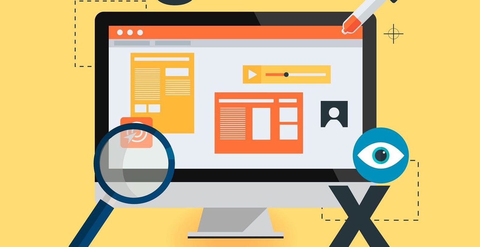
A business website can play a significant role in a company’s success. A well-built site will perform various functions for a particular business or industry. The most basic site might provide information about the company, including contact and team-member information. At the other end of the spectrum lies the fully interactive portal that encompasses buying and selling. Some websites sit somewhere between the two extremes, where they include both company profiles and forms for accessing goods and services.
At the very least, your website is a door into your business. It should be strategically designed to invite customers in, rather than crafted in ways that frustrate them. Above all, your site should be one that is approachable, both aesthetically and technically. When designing or revamping a website, you will find the following four features important if you want your site to be effective.
Distinctive and Respectable
Your website provides the first impression to a prospective customer or client. That impression speaks to your professionalism, fairly or not. However else the site functions, know that at its heart it must serve a public relations purpose while building trust in you and your company.
Four visual cues are assets in this regard. Page layout and design must be consistent throughout. Your branding should be readily on display, including company logos, graphics, and the colors of borders and backgrounds. Any text passages must be well-written without grammar and style errors. Photos should be clear, engaging, and professional.

Navigation Friendly
A pleasing and professional appearance, by itself, is not enough. Shape your website so that navigation is intuitive. For example, menu terms and hyperlink text should clearly indicate where they will take you when you click on them. Do not create too many menu items, and make certain each one has a significant purpose. To accomplish this, clarify who your users will be, whether clients or shoppers, and make certain all have equally-quick access to their relevant pages.
Decide upfront how many of these pages are necessary to provide both your message and business services. The homepage is your most important page; it should function as an office receptionist or information-booth guide. It should serve as the jumping-off point to all else rather than act purely as a promotional piece. You also have to decide whether to open with a splash page or not. This welcome screen, which opens before a landing page or the homepage, can be perceived as either informative or frustrating.
Accessible
An outcome too often overlooked, accessibility is both a practical and an ethical consideration. International Web Content Accessibility Guidelines have been created to make sites manageable for people with disabilities. Since these standards guide approaches to images, text, and sound, as well as site structure, you should implement as many as you can when creating your pages.
For example, alternative text is a short caption created in a page’s HTML markup. The phrase relates to an image so that a screen-reader can describe it for a user. Another example includes making your site keyboard-friendly so that a mouse click is not necessary to activate a specific function. By employing accessibility principals, you are not only doing what is right, but you are expanding your customer base.
Contact-Friendly
Those who visit your site for an overview may eventually want to explore further. Nothing frustrates a client or customer more than contact roadblocks when they want more information before moving forward, or they want to follow-up on an order. If they have to wait a day or more for a response, or if there is no clear avenue to connect with a representative, they will turn to other sources next time.
A question-and-answer page can go a long way to getting information out. However, you need to go beyond that static form. Build in features that give customers access to a person so that they feel a connection. A live chat service as part of your website, for example, provides customer responses even when you and your team are away. You can even link web chats and live phone support for increased efficiency.
Think of efficiency as an overriding theme within a well-designed website. Navigation should be intuitive and productive. When your customers and clients have access to a pleasing and easy-to-use site, you will find your business grows as a result.


